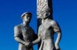
Studio Holmax
Collective Mind
The Magnificent Seven rock logos
As AC/DC lead guitarist Angus Young ponders the band's future following the departure of key members, let's remember that it wasn't just music that allowed the Australian band to take their place in rock 'n' roll Valhalla.
For seventy years now, the AC/DC logo has appeared on lists of the best rock labels, becoming a true graphic classic. There is an amazing story behind this logo, like many others. legendary bands. Some logos appeared unexpectedly, impromptu, others - as a result of much thought and creative search by the musicians themselves.
So who are these seven outstanding rock logos?
1. AC/DC: Biblical Lightning, designer Gerard Huerta, 1977.

In 1977, Bob Defrin, the art director of Atlantic Records, commissioned 24-year-old freelance graphic artist Gerard Huerta to depict the name of AC/DC for the cover of their second American album, Let There Be Rock. Huerta had already done the lightning flash lettering for their first American album, High Voltage.
“My goal was to represent the theme or title of the album through letters,” says Huerta, “and “Let There Be Rock” evoked direct associations with the Bible.”
Two years earlier, Huerta had done typography for an album by the New York band Blue Oyster Cult: “The cover featured an empty limousine against a backdrop of a small church and an ominous sky. For that job, I studied religious typography." His favorite was the Johannes Gutenberg font used for a famous 15th-century edition of the Bible, which Huerta used for the Blue Oyster Cult logo. “So when I received the assignment to work on the sign for “Let There Be Rock,” I turned to Gutenberg again.”
The album cover depicts the band under a gloomy sky, pierced by bright lights from the heavens. Huerta drew several combinations of the Gutenberg font and a flash of lightning, and in the end the 3D version in orange was chosen.
But until Huerta began drawing logos for Blue Oyster Cult and AC/DC, he had never even heard of such a musical genre as heavy metal, but his design was later parodied in the film “This Is Spinal Tap” (a 1984 mockumentary about fictional British rock band, whose success is on the wane).
For 40 years, Huerta's drawings for "Let There Be Rock" sat in a box, buried under thousands of other works, until he posted them on his Facebook page in July of this year. Huerta won't say how much he was paid for designing the logo, which started out as a sign for just one job, but he never had any exposure to the band or even met any members of AC/DC.
Huerta designed the logos and decoration for several other groups (eg Foreigner, Boston, Ted Nugent) and design for such top magazines as Time and People weekly. His work includes the Swiss Army emblem and the development of the Nabisco foods brand. According to Huerta himself, the logo that became recognizable thanks to the music of AC/DC is not his greatest pride: “If I had to choose, in 1981 I would choose the logo for CBS Masterworks, which appeared on the line of famous albums.”
2. THE BEATLES: protruding "T" - designer Ivor Arbiter, 1963.

A short meeting in a London record store between its owner and manager The Beatles Brian Epstein - part of the history of one of the most famous logos of all time. The famous logo of the 20th century was drawn in a few seconds by a person without an art education.
In May 1963, Ivor Arbiter became the owner of the first specialist drum kit shop on Shaftesbury Avenue. Drum set The Premier, which Ringo Starr played, needed a replacement, and the Beatles' manager brought it to Arbiter's shop. As he later recalled, he received a call from the store: ““Someone named Brian Epstein came, and with him a drummer.” I hadn’t heard anything about the Beatles then.”
Starr wanted to replace the drums with a kit from the same Premier company, but the salesmen were instructed to promote the Ludwig brand, which Arbiter had just begun importing from the States. When Starr chose a Ludwig-branded installation with a black-and-white mother-of-pearl finish, Arbiter was extremely pleased. But Epstein told Arbiter that the Beatles were going to be great and that he should give them the £238 kit for free!
The Arbiter agreed to take Starr's battered drums as partial payment, but only if the Ludwig logo was on Starr's new kit. Epstein accepted the deal on the condition that the group's name be written below and above large print. And then Arbiter took a piece of paper and drew on it what everyone now knows as the iconic logo of The Beatles with a capital “B” and a “T” protruding from below. These two letters create a pun: the English “beat” means beat, beat.
The drum salesman was paid £5 to arrange for local sign maker Eddie Stokes to paint a brand new logo on Ringo's kit during lunch for an additional fee. The logo was officially registered after Epstein's death. By that time, The Beatles had founded Apple Corps (a multimedia corporation that replaced The Beatles Ltd). This is the official logo for now.
3. THE WHO: symbol of Mars - designer Brian Pike, 1964.

According to official history The Who, published in 2015 and written with the participation of Pete Townshend and Roger Daltrey, the iconic logo was created for the poster of the famous London Marquee Club in November 1964. The rather expressive black and white poster showed Townshend (lead guitarist) strumming the strings powerfully. The typography is equally strong, with the two letters combined and the arrow coming out of the "O" a nod to the brutality of the band members.
Keith Lambert, who had just become manager of the band formerly known as High Numbers, and his partner Chris Stump commissioned the poster from designer Brian Pike. The typography from the poster soon appeared on Keith Moon's drum kit.
Although Townsend studied for some time in art school Ealing, he had nothing to do with the logo. But Townsend influenced the popularity of the symbols of the Royal Air Force. In 1965, he began wearing a Union Jack jacket, covered in World War medals, and designed a T-shirt featuring the RAF insignia, which most of his countrymen associated with British defense. It was supposed to be irony, not a gesture of patriotism.
4. THE GRATEFUL DEAD: Skull and Lightning - Designed by Osley Stanley and Bob Thomas, 1969.

Osley Stanley - sound engineer for The Grateful Dead - was always annoyed by the chaos behind the scenes: the equipment different groups lay in one heap. And in 1969, he decided that the band needed some kind of branding to distinguish The Grateful Dead's equipment from the rest.
One day, on the way, he noticed a road sign that was greatly distorted in the side windows of the car. All he saw was an orange circle at the top and a blue circle at the bottom, separated in the middle by a white stripe. At that moment, the logo that brought Stanley fame was born: “If we change the orange to red, and the stripe to a lightning bolt, then we get a wonderful mark by which we could distinguish our equipment.”
Arriving home, Stanley talked about the idea to his neighbor, designer Bob Thomas, who was also the group's security guard. Thomas quickly made a sketch, and their friend Ernie Fischbach showed how the sign would look on the tree. A few days later, Stanley asked Thomas to add "Grateful Dead" in a circle so that from a distance it would look like a skull.
“I think I was too influenced by the posters of the time,” says Stanley. The design was changed several times until it appeared on the cover of the Steal Your Face album.
5. THE ROLLING STONES: tongue and lips - designer John Pasche, 1969.

In 1969, designer John Pache was still studying at the Royal College of Art when he was suddenly called to meet Mick Jagger at the band's rehearsal space. Jagger was looking for a suitable young artist to create a poster for the band's upcoming 1970 European tour, unlike most of the band's posters.
Pache later recalled that he and Jagger chatted about art and found a common interest in classic art deco in travel posters of the 1930s and 40s. Pache's work was eventually used for a European tour in 1970, a US tour in 1972, and a Euro tour in 1973.
Then Pache received an invitation from Jagger to visit his home in Chelsea Chain: this time he needed a logo for Rolling Stone tickets and posters.
“To be honest, the meeting was short,” recalls Pache. “He gave me a wooden figurine that he bought from a corner shop. It was an image of the Hindu goddess Kali, with her tongue hanging out. He said: “I see something like this. Go think about the idea, then we’ll meet and discuss options.”
According to rumors, Pasha was immediately inspired by Kali, the mouth and long tongue of the customer. But Pache denies everything: “Many people ask whether the image was inspired by Mick Jagger’s tongue and lips. Initially no. But it could have come out subconsciously.” In any case, he left Jagger's house with a ready-made image of an expressive mouth. “I went and made several drawings right away that were very close to the final version.” Jagger liked the sketches. “I finished the sign, he showed it to the rest of the group, and they gave the go-ahead. So they started using the sign and I received a fee of 50 pounds.”
Fans first saw the logo on the cover of the Sticky Fingers album in 1971, then it became a registered mark of the group and appeared on all of its albums. Why is the sign still relevant today? “I think the logo has stood the test of time because it is universal,” says Pache. “Sticking out your tongue is associated with protest, denial of authority, this gesture is relevant for every generation.”
The original sketches of the Pache logo are now stored in private collection in London, the artist sold them in 2015 for an unknown amount.
6. KISS: Flash of Lightning - designer Ace Frehley, 1973.

Paul Daniel Frehley, better known as Ace, joined Paul Stanley, Gene Simmons and Peter Criss under the name Wicked Lester as lead guitarist in January 1973. And it was he who developed the logo for the reborn group, which came under the radar of all the media due to its obvious reference to Nazi symbols.
For the first time, Frehley scribbled the sign directly on top of a Wicked Lester poster. The letters "K" and "I" were accepted well, but the double "S" caused a lot of problems. Paul always claimed to have depicted them as lightning bolts, but the design began to attract attention due to its resemblance to Hitler's SS shoulder straps. In 1979, Germany banned the logo (followed by Israel and a number of other countries), associating the "SS" with the Nazis and the Holocaust. In these countries, the group still uses the less controversial spelling.
After KISS disbanded after their "farewell tour" in 2001-2002, Stanley and Simmons (who are both Jewish) accused Frehley and Criss of being anti-Semitic in the band's early days. In his 2002 autobiography, Kiss and Make Up, Simmons wrote: "Ace was fascinated by Nazism and, in a drunken stupor, shot several tapes of himself and a friend dressed as Nazis." Simmons claimed that Ace once stormed into his hotel room dressed in a Nazi uniform and shouted, "Heil Hitler!"
7. NIRVANA: smiley face, designer Kurt Cobain, 1991.

The band's typography came about quite by accident, thanks to their first album, Bleach, on Sub Pop Records in 1989: in an effort to cut costs, Lisa Orth, the label's art director, suggested that designer Grand Alden use the first font he came across. It turned out to be Onyx, which is still applied to all the group’s paraphernalia.
There are many theories about what exactly inspired Krut to draw that smiley face. According to one version, it is the emblem of the “Lustful Lady” strip club in Seattle, 150 km from Aberdeen, Washington. But the smiley face, usually yellow on a black background, had already surfaced in 1964 as a symbol for insurance company employees, drawn by graphic artist Harvey Ball. Alas, the truth about the origin of the smiley died with Cobain in 1994.
Given his suicide and endless history with drugs, there is some surprising contradiction between the name Kurt gave his group - the highest goal of Buddhism, the liberation of the soul from the cycle of death and rebirth - and the out-of-control, irrelevance of his sketch. This combination of the incongruous is perhaps what makes the logo so strong. And to be honest, it doesn't really matter why or how he came to be, as long as he represents NIRVANA.
Today we invite you to recall the most famous logos of groups from all over the world, which have long lived outside of music and, it seems, are no longer associated with specific musicians at all.
1. "Snaggletooth" (War-Pig) - Motorhead
The legendary "Snaggletooth", aka "War-Pig", appeared on Motorhead's first studio album in 1975. The main author of the drawing was the artist Joe Petagno, who combined the skulls of a gorilla, a dog and a wild boar to create the “war pig”. Lemmy later stylized the character, adding brutality to him with chains and spikes. "War-Pig" has appeared in various variations on 20 covers of the band's 22 studio albums. Motörhead merch with the company logo has not lost popularity for several decades.
2.Misfits![]()
The Misfits' ghost first appeared on the cover of the third single, "Horror Business". The musicians, inspired by the TV series “The Crimson Ghost”, filmed in the mid-40s, took as a basis the appearance of the main character - the Crimson Ghost. The image is used everywhere, everywhere, and seems to already exist separately from its cinematic and musical progenitors.
3. Slayer
Thrash metallers Slayer, like musicians from Motörhead, have been repeatedly accused of being Nazi sympathizers. The main reason for this was the logo, supposedly similar to the coat of arms of the Third Reich. The crossed swords with the band's name in the center first appeared on the band's first album, 1984's Show No Mercy. The author of the drawing was the father of one of the members of the “road team”. At the beginning of their journey, the guys from Slayer used a satanic image, so three sixes, various variations of crosses and images of demons were regularly added to the allegory of the pentagram. Today, the legendary print appears on all kinds of clothes for people who are far from not only heavy music, but also from understanding the meaning of this image.
4.AC/DC
It is difficult not to note that the name of the group was not difficult to depict in a graphic style. Sharp and angular letters, which in the original version were more rounded, came from the hand of American designer Gerard Huerta in 1977, becoming one of the components of hard rock. The lightning bolt located in the middle gave the logo a special recognition. One of those logos that will be clear even to those who have never heard their music.
5. “Dead Smile” - Nirvana
For his main project - the group Nirvana, Kurt Cobain drew the logo himself. Despite its obvious simplicity, the image quite clearly conveys the nature of the music and style of the grunge band. The dead-eyed emoticon, known to millions of music lovers, did not appear on any studio or live album groups. Reflecting ambiguous emotions, the drawing has become popular in its own right and is associated with the prototype of Kurt Cobain himself with all his internal struggles and contradictions.
6. Ramones
The Ramones logo is the full-fledged seal of the fathers of punk rock, similar in style to the official seal of the President of the United States. The author of the logo was a longtime friend of the musicians, Arturo Vega, according to whom the group was the best in America and had every right to borrow the president’s seal. As planned, the eagle holds a baseball bat for the group's opponents and an apple tree branch for the followers. Biographers noted that the musicians earned a tidy sum from selling T-shirts with this image, and some punk bands are still inventing their own variations of the logo.
7. "Hot Lips" - Rolling Stones
Surely everyone knows these “lips” from the cradle - and it doesn’t matter whether you’ve heard of rock and roll at that moment. The author of the work, John Pace, was 24 years old when Mick Jagger invited him to develop a logo design for the Stones. Using the prototype of the Hindu goddess Kali, as well as the wishes of Jagger himself, the designer prepared an ambiguous image of lips with a tongue that looked somewhat provocative and vulgar, especially for the early 70s. However - doesn't all this best describe rock and roll? Almost 50 years after its appearance, the logo does not lose popularity and according to many music magazines is the most successful and recognizable in the world.
Despite the abundance of pop singers and singers on the modern stage, rock, as well as other trends in music, continues to live. We all know groups like AC/DC, KISS, The Rolling Stones and others. They are recognizable not only because of their creativity, but also because of the symbolism that used to be seen on almost every fence, both here and abroad. Let's take a look at how some logos came into being that have become very famous.
Let's start, perhaps, with Grateful Dead

This logo, which became the band's official logo, is one of many created by Bob Thomas. The logo was constantly improved as the group rose to fame. The first version of the logo appeared in 1969, and the purpose of creating a recognizable sign was to highlight the group during constant flights/relocations during tours. At first it was just a red and blue circle, to which Bob Thomas added a skull. The logo remained largely unused until 1976, when the band decided to add their logo to the cover of the Steal Your Face album.
After this, the logo became as recognizable as the musicians themselves, and to this day the simple stylized drawing that you see in the photo is the most recognizable symbol of the group. By the way, the style in which this drawing is made is very interesting - according to Thomas’s plan, it should have been something like “Yin-Yang”. And indeed, there is something in common.
The Rolling Stones

The symbols of this famous rock band were created by an ordinary student from the Royal College of Art in London. A student was asked to create a poster to "promote" The Rolling Stones' European tour. The poster turned out to be so successful that Mick Jagger asked the author to come up with a logo, showing the artist a drawing of the Indian goddess Kali, which he wanted to use as a basis.
The work was done, done perfectly, and now the symbol of the group is known to almost every music lover on our planet. By the way, the rights to the drawing, to its original, still belong to the creator, and now he has decided to sell his creation for 300 thousand euros. However, a buyer has not yet been found.

It is quite rare that the musicians themselves create a symbol own group, without the help of artists and designers. However, Kiss bands that’s how it all turned out - the band’s guitarist, Ace Frehley, created the logo back in 1973, for the second album “Hotter Than Hell”. Since then, this symbol has been almost the second “I” of the group.
The logo design was part of the overall idea, with the creation own style- painted faces, original stage costumes and everything else. Probably, the popularity of the logo is explained by the fact that, despite its simplicity, the logo very successfully symbolizes the strength and energy that is inherent in this team.

This group is sharply different from the previous one, and yet, there is something in common in the style of the logo of both groups. The logo's origin story is also somewhat similar: the AC/DC logo was created by Gerard Guerta for the original "Let There Be Rock" album cover. Immediately after the release of the album, the sign became a symbol of the group, which is known to all rockers; it is simply impossible to confuse it.
An interesting fact is that the group practically did not use the symbol until 1978, when it released new album"If You Want Blood You've Got It." Fans of the group believe that it was this logo that became the link between this musical genre and gothic symbolism.


The first version of this singer's logo was created by Paul White for the album "Debut", released in 1993. The logo was used in the symbolism of the first three albums, and then was discarded as the singer began working with other designers.
Paul White created the logo for former group Björk, "Sugar Cubes". Some of the work included 3D modeling and other advances in modern computer technology. Interestingly, it was this logo that served as the basis for the formation of the style of groups of a similar genre in the 90s of the last century. Currently, only the first letter of the logo, “b,” is most often used, in different variations.
This issue is a trial one, if you like it, there will be future ones, because famous groups there are many, and they are all interesting in their own way.
Any creativity, regardless of its original meaning - be it a commercial project, or simply a spiritual necessity, sooner or later faces the issue of promotion - as one of my friends sang, “The whole point is that we are not looking for fame, but if we find it, then We won’t give it to anyone!”
If we talk about music, then of all its genres, rock has, perhaps, the most optimal ratio of the width of the audience to the level of its involvement. And, therefore, the richest treasury of promotion methods.
So, you set out to become famous. The team was found, the style was more or less chosen, the name was invented. It's time to think about the logo. What should it be like? To begin with, I suggest you familiarize yourself with the results.
Firstly, the color and shape of the logo should reflect the components of your creativity - text, sound, show. In this regard, the first rule:
1. Expression of music in the logo. Take a look at the pictures. The first of them shows the contrast between the brutally bloody “Cannibal Corpse” and “Scorpions”, business card which always had a clear sound. And in the second picture, the Aria logo repeats the style of the Iron Maiden logo, just as the group itself copies the sound and even fragments musical compositions kings of heavy metal.


Now, men, remember your childhood! Probably only the laziest among us has never drawn the outlines of the Metallica and AC/DC logos on a wall/desk/notebook cover? Even those who had never heard them did this. I suspect that you also drew the names of the groups - the leaders of my above-mentioned survey. Please note: the logos of “Alice” and “DDT” seem to be telling us “Draw me!” I present to you the second rule of a rock band logo. Let's call it like this:
2. Ease of reproduction on surrounding objects. This property of the logo is very important, since one of the channels for promoting a rock band is viral advertising on objects of architecture, interior design, etc., distributed by young fans. And this is no coincidence: rock music carries within it doubt in social foundations and a protest against their inviolability, just as an inscription seems to indicate to a wall its imperfection.
Let's move on. The logo of a rock band should be easy to apply and look bright on elements of paraphernalia: T-shirts, hats, bags, pendants, etc. And the more the logo allows you to “walk around”, the more more people he will be “dressed” and seen. Therefore the third rule:
3. Adaptability to the production of paraphernalia. For this it is preferable bright color, letters of medium thickness, preferably without outlines. As for the background, the most convenient color was discovered a long time ago - black. However, he is also the most “hackneyed”. You can, of course, experiment with a different color, but no one dares. Because the more different a rocker is in color, the less associated it is with rock.
What else will help give your logo a lasting characteristic? Of course, the signs that will be the first to tell you about the content of your work. Rule four:
4. Additional semiotic elements. They will help identify the philosophy of the group, and therefore help remember the name. However, they also have a minus - a cliché that will be very difficult to “wash off” if the rock direction changes. So use your own discretion. So if you preach an idea universal love- you can add “pacific” to the logo. If you do not recognize power, you can say so using the sign of anarchy. Your lyrical hero experiencing severe mental anguish? The cross will hint about this. Add a pentagram to your logo if your songs are permeated with something scary and ominous. You can also put something mysterious. For example, runes (as is done on the logo of the Picnic group). The only question is whether everyone will notice and understand them.

Now I ask you to pay attention again to the results of my survey. As you can see, all voting leaders have short logos. Conciseness! Here's something else that will help you remember. Fifth rule:
5. Easy to read and short logo. And even if you are already in the rush to come up with a long name, you can always turn it into an abbreviation or abbreviation. Remember such second names of groups as “NAU” (“Nautilus Pompilius”), “AU” (“Automatic Satisfiers”), “GO” (Civil Defense), and even Boris Grebenshchikov is better known as “BG” than as a leader "Aquarium".
There is such a feature of most of our compatriots - a craving for foreign things. And many musicians write the names of their bands in Latin, which “fogs” perception, forgetting about the sixth rule:
6. Authentic language.“Write” in the language you sing in. And you and your logo will be one.
And the last basic rule. Do not forget about the correct matrix of emotions that is characteristic of all logos (the direction of the main part of the logo from the lower left corner to the upper right). And also remember about the alternative to the matrix of emotions in rock band logos - symmetry.
7. Correct matrix of emotions and symmetry. The first gives the logo dynamism and development-oriented, and the second - perfection, to which any music fan subconsciously gravitates.
Let's look at the logo of one of the survey leaders - the Alice group. First of all, the logo tells the history of the group. A group born in the USSR with a great future. The future of the group is “prophesied” by the combination of the correct matrix of emotions with symmetry. Pay attention to the time period of the Alice logo: it is written as if on the topic of the day. But the point is that such topical topics are always in demand in our society. In addition, the logo has a “quick handwriting”, which conveys the revolutionary mood of the group’s creativity. Cool? And all this fits into a laconic inscription.
As an alternative example, I present to you the logo with the coat of arms of the Queen group. Created professional designer, the leader of the group Freddie Mercury, he talks not only about the philosophy of the group, but also about its members. And, although due to the complexity of this work of art, only collectors of the group’s work are familiar with it, the very existence of the coat of arms music group is historical. And the group compensated for the little-known logo with shockingness in other directions.