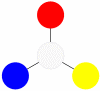
Primary colors are the tones that can be used to obtain all other shades.
This is RED YELLOW BLUE (for printing this is MAGENTA, YELLOW, CYAN, BLACK see below)
If you mix red, blue and yellow light waves together, you get white light. However, such a merger will not work with paints. For artists, there is a separate mixing table, which overlaps with the combination of waves, but follows its own rules.
So in practice at , which does not exist in spectral light, but is the response of our eye to the unbalanced reflection of waves. (cm. ).
Yellow, red, blue - different ones, in which they are at their peak. If you convert them to black and white format, you will clearly see.
It is difficult to imagine a bright dark yellow tone, as well as a bright light red one. Due to brightness in different lightness ranges, a huge range of intermediate saturated colors is created: orange, red-orange, light green, emerald, blue-green, lilac, red-violet, violet, etc. These three colors form almost the entire palette, with the exception of black, white, gray. Taking them as the primary basis of color construction, it is worth imagining that secondary colors are still less bright than their parents, and shades formed from the second circle using black, white or shades produced from the primary circle are even duller.
Constructing shades from primary colors
Pairs from the “team” of primary colors form the following colors of the second circle:

ORANGE_____________PURPLE_______________GREEN____
YELLOW + RED = ORANGE(cm. )
RED + BLUE = PURPLE(cm. )
BLUE + YELLOW = GREEN(cm. ?)
If you mix secondary colors, that is, orange, purple and green, with the primary ones (which are already present in the color), then their order will not change, they will also remain in the second circle, since we are changing the quantity of content, not the quality:

YELLOW-ORANGE_____RED-ORANGE_____RED-VIOLET___
YELLOW + ORANGE = YELLOW-ORANGE
RED + ORANGE = RED ORANGE
RED + PURPLE = RED-PURPLE

VIOLET-BLUE___________BLUE-GREEN___________LIGHT LIGHT___
BLUE + VIOLET = BLUE-VIOLET
BLUE + GREEN = BLUE-GREEN
YELLOW + GREEN = LIGHT LIGHT
Adding primary tones to the secondary, but which are not already present in it, leads to a mixture of all three primary colors. The result is brown. Such pairs are called complementary.

YELLOW+ PURPLE ( RED + BLUE) = BROWN
RED+ GREEN ( YELLOW + BLUE) = BROWN
BLUE+ ORANGE ( RED + YELLOW) = BROWN
Mixing complementary shades such as purple + yellow, red + green, blue + orange gives a medium dark red-brown shade. If you mix not paint, but light rays, you should get the effect of gray light. But since the paint only reflects the wave, there will be no 100% replacement.
Primary ink colors for printing
It is very important to obtain the maximum tones from a minimum set of inks for color printing. Today, there are 4 necessary colors to realize the entire spectrum, where red is replaced with rich pink. Like this.
MAGENTA, YELLOW, CYAN, BLACK

Where magenta is a fuchsia shade, cyan is a bright blue color, and white is the tone of the printed material.
How to get other colors and their shades: theory and practice. Click on the icon.
Unlike most objects in the surrounding world, computer monitors do not absorb light, but emit it. To describe the processes of color formation on the screen, a model called additive color synthesis was required. In this model, color is obtained by adding several basic (primary) colors: red, blue and green.
Hue(hue)
Hue is a value that determines the position of a color in the spectrum. For example, green is located between yellow and blue. For the desktop, this attribute can be set in Control Panel.
Saturation(saturation)
Saturation is a color management parameter; purity of shade of color ranging from gray to pure color.
Brightness(brightness)
Color brightness on a scale from black to white on a user's monitor. Measured as a percentage: from 0 to 100%. Zero brightness is black.
|
100% |
R- Red |
||
|
100% |
B- Blue |
||
|
100% |
G - Green |
||
|
100% |
Y- Yellow |
C - Cyan (Cyan), M - Magenta (Purple), Y - Yellow (Yellow), G - Green (Green), B - Blue (Blue), R- Red (Red), O - Or ange (Orange), P - Purple (Purple).
Primary, secondary and tertiary colors
|
|
Primary colors: red, blue, yellow (three "primary" pigments of red, blue and yellow) are called CMY system (Cyan, Magenta, Yellow or CMY system). |
|
|
Mixing blue and yellow flowers gives green. A mixture of yellow and red - orange, blue and red - violet color. These three colors (green, purple and orange) are called secondary colors. |
|
|
Mixing primary and secondary colors with their closest shades gives. Tertiary or intermediate colors are orange-red (1), yellow-orange (2), yellow-green (3), blue-green (4), blue-violet (5) and red-violet (6) (Yellow-orange, red-orange, red-purple, blue-purple, blue-green and yellow-green) . |

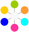
This produces 12 colors:
|
Magenta |
Scarlet |
Red |
Orange |
Yellow |
Lime |
Green |
Turquoise |
Cyan |
Indigo |
Blue |
Purple |
Illustration color formation as a result of absorption or reflection of three primary colors (red, blue, yellow).

|
Color |
Absorption |
Reflection |
Result (appears) |
|
|
Light red |
Green & light blue |
Cyan |
||
|
Light green |
Red and light blue |
Magenta |
||
|
Light blue |
Red and light green |
Yellow |
||
|
M+Y |
Green & light blue |
Light red |
Red |
|
|
C+Y |
Red and light blue |
Light green |
Green |
|
|
C+M |
Red and light green |
Light blue |
Blue |
|
Where: Cyan ( C), Magenta (M), Yellow (Y). It's called the CMY system.
See:
Web Design Styles Web Design Styles 2 (3 color combination) Web Design Styles 3 (3 color combination) Web Design Styles 4 (3 color combination) Web Design Styles 5 (4 color combination) Web Design Styles 6 ( combination of 4 colors) Red styles Orange styles Yellow styles Green styles Blue styles Blue styles Purple styles Gray styles Web design styles 7 (page layout) Web design styles 8 (page layout) Web design styles 9 (page layout) Web styles design 10 (page layout) Web design styles 11 (page layout) Web design styles 12 (page layout) Web design styles 13 (page layout) Web design styles 14 (gradient backgrounds) Web design styles 15 (gradient backgrounds ) Web design styles 16 (gradient backgrounds) FAQ on styles Corporate style (examples of corporate styles) Our style
General information
With the combined action of a stream of photons of equal intensity of all wavelengths of the visible spectrum on the human visual apparatus, a sensation of white, uncolored light appears.
Thus, the combined action of light streams, causing a feeling of corresponding spectral And additional to spectral flowers, evokes a feeling white. This is where the term “complementary color” comes from.
Additional colors is mixed colors, since their sensation is caused by the combined action of monochromatic rays, which separately would cause sensations of their spectral colors.
Finding Complementary Colors on the Color Wheel
Primary and secondary colors
To mechanically obtain additional color, special non-absorbing beam splitting mirrors were used.
Practical application of complementary colors
In design, design practice, and when creating advertising, effects associated with the psychological assessment of colors as complementary are widely used. Combinations of complementary colors are often perceived by people as harmonious.
Literature
- Gurevich M. M., Color and its measurement, M.-L., 1950.
Notes
See also
- Spectral and complementary colors in color theory
Wikimedia Foundation. 2010.
See what “Secondary colors” are in other dictionaries:
See Primary and Secondary Qualities. Philosophical encyclopedic dictionary. M.: Soviet encyclopedia. Ch. editor: L. F. Ilyichev, P. N. Fedoseev, S. M. Kovalev, V. G. Panov. 1983. SECONDARY QUALITIES ... Philosophical Encyclopedia
Main article: Psychology of color perception In the HSV color space, opposing colors are complementary; when mixed, they produce shades of gray Complementary colors ... Wikipedia
Secondary colors- Secondary colors of subtractive synthesis (red, green, blue); Secondary colors (subtractive synthesis) ... Brief explanatory dictionary in printing
Main article: Psychology of color perception In the HSV color space, opposing colors are complementary; when mixed, they produce shades of gray. Complementary colors are pairs of colors, the optical mixing of which leads to the formation ... ... Wikipedia
According to Johannes Itten (1961) The color wheel is a way of representing the continuity of color transitions, as well as the HSB model. The sectors of the circle are painted in different colors... Wikipedia
Toland John- From everything that has been said so far, it is easy to understand that in France the Enlightenment received its most vivid and varied expression, fame and, in a sense, its greatest influence. But we must not forget that the ideas that have become widespread... ... Western philosophy from origins to the present day
Rock- (Rock) A rock is a collection of minerals that forms an independent body in the earth’s crust, as a result natural phenomena Groups of rocks, igneous and metamorphic rocks, sedimentary and metasomatic rocks, structure... ... Investor Encyclopedia
PLAGUE- PLAGUE. Contents: Etiology...................630 Epidemiology...................638 Geographical distribution. .......644 Pathological anatomy................650 Pathogenesis................656 Clinic .......................657… … Great Medical Encyclopedia
Contents: 1) Basic concepts. 2) Newton's theory. 3) Huygens ether. 4) Huygens' principle. 5) The principle of interference. 6) Huygens Fresnel principle. 7) The principle of transverse vibrations. 8) Completion of the ethereal theory of light. 9) The basis of the ether theory.… …
Contents: 1) Basic concepts. 2) Newton's theory. 3) Huygens ether. 4) Huygens' principle. 5) The principle of interference. 6) Huygens Fresnel principle. 7) The principle of transverse vibrations. 8) Completion of the ethereal theory of light. 9) The basis of the ether theory.… … Encyclopedic Dictionary F. Brockhaus and I.A. Efron
Books
- Digital photography. Practical guide. Advanced course. Set of 5 books, Freeman Michael, Duckworth Adam, Tipling David. Contents of the kit: Michael Freeman "Low Light Photography: A Practical Guide" (192 pp.) Adam Duckworth "Flash Photography: A Practical Guide" (192 pp.) Michael Freeman "…
Passion for color
What is a color wheel for?
The color wheel shows how subtractive colors interact with each other.
This is the main tool for a colorist when working with color.
The color wheel is a colorist’s color model that allows you to understand how colors interact with each other and use this knowledge in your work. The better you understand the color wheel, the more you study it, the more and more interesting working with color becomes. Checked!
Studying the color wheel is the basis of all further knowledge about hair coloring. Understanding the color wheel determines your perception of color.
The color wheel demonstrates primary and secondary subtractive colors and describes how they interact with each other. This makes it the main tool when working with color. We all studied the color wheel at the beginning of our careers, but not everyone paid enough attention to it, considering this information to be of secondary importance.
Primary and Secondary colors
Primary colors are colors that cannot be obtained by mixing others.By mixing these three colors you can get all other colors and their shades. In the subtractive color model, about which we're talking about, the primary colors are Cyan, Magenta and Yellow.
In describing color theory in relation to hair coloring, it is impossible to use pure cyan and pure magenta (they are not used in the production of dyes), so the colors closest to them are blue and red.
 Secondary colors are obtained by mixing primary colors in equal proportions
These six colors form the basis of the color wheel.

3. Tertiary colors

Mixing one primary and one secondary color in equal proportions produces a color called tertiary: yellow-orange, red-orange, red-violet, blue-violet, blue-green, yellow-green. These colors are also called intermediate colors.
Color Wheel
 Primary colors do not have the same intensity
 On color wheel you can see that not all primary colors have the same intensity.
The influence of red on the color result of a composition will always be more noticeable than the influence of yellow.
There will be fewer intermediate colors visible to the eye in the yellow-orange spectrum than in the blue-green spectrum.
Colors that have different tones, with other characteristics being equal, are perceived by us with different lightness. Yellow tone itself is the lightest, and blue or blue-violet is the darkest.
 Complementary colors have 2 contradictory effects:
 - Mutual neutralization
- Enhance each other's brightness
Every color has a complementary color. This is a color that occupies the opposite position on the color wheel.
Both effects can be used in color design. The ability to use these effects expands the capabilities of the colorist.
How does this work?
1. If you mix 2 complementary colors of equal intensity, they will mutually neutralize each other, the color result should be neutral, gray-brown.
This effect is very useful in the daily practice of a hairdresser and is often called the neutralizing effect.
2. However, if you place these two colors next to each other in a sector coloring so that they do not mix, the effect will be the opposite: the colors will visually appear brighter than they are, and you will get maximum contrast. In this way, you can highlight one color as much as possible by placing it “against the background” of another color that is complementary to it.
Chromatic and achromatic colors
 Chromatic colors are pure colors that do not contain white, black and gray.
 The color wheel only shows chromatic colors.
When two primary colors are mixed, a different chromatic color is obtained. Chromatic colors are colors that do not contain admixtures of white, black and gray.
Achromatic colors
 White and black are primary achromatic colors; All shades of gray obtained by mixing white and black are secondary achromatic colors.
 White and Black are achromatic colors. These colors are not included in the color wheel.
According to their characteristics, they have the status of primary colors.
All shades of gray obtained by mixing white and black are secondary achromatic colors. By using achromatic colors we add depth to chromatic colors.
How is depth of tone created?
By mixing all three primary colors or two primary colors with black, the desired depth is achieved. We can get any shade by mixing chromatic and achromatic colors: red and yellow with black or gray.
 By mixing three primary colors or two primary colors with black, the desired depth of tone is achieved. In theory, the end result of mixing three primary colors in maximum concentration will be black. In practice (both in hair coloring and in printing), the result of such mixing will be a very dark gray-brown color, since the pigments used are not pure primary colors.
Adding depth to a color inevitably reduces the brightness of a relatively pure primary color. Therefore, colors that have depth can be called dull.
All artificial hair colors, as well as natural ones, are dull colors.
The more depth we add, the darker the result and the less bright the hue will be.
Natural color hair is also a combination of chromatic and achromatic colors(pheomelanin and eumelanin).
On the color wheel, neutral chromatic colors are located in the center.
When coloring your hair, you need to understand the effect of tone depth on color. The character of any color will change as its depth changes.
Hint: reproducing Itten's table helps train color perception.
 This table allows you to evaluate the change in shade when changing its depth and compare different colors same depth of tone. You can reproduce the table using cut cards or using strands of hair from the palette.
For example: the shade that we used to call Chocolate is essentially a dark orange color.
Rich chocolate tone is a combination of color and depth. If there is not enough depth, the color will become close to orange.
If you apply a medium brown chocolate shade to a light base such as 7-0, the lack of depth will result in a brighter, more orange tint.
Green, blue and purple conventionally belong to the group of cool (matte) shades. Red, orange and yellow belong to the group of warm (fashionable) shades.
Grey/blue-violet = Sandre
Grey/Blue = Ash
Olive/Blue = Matte
Yellow = Golden
Orange = Copper
Red = Red
Magenta = Violet
The color wheel has changed to reflect modern terminology and practice and more accurately reflect the rules of working with color. Some color names differ from the original names to suit the results obtained. For example, painting with ashy shades gives a muted ashen result rather than a bright one. blue.

Knowing the exact positions of shades on the color wheel helps when creating a color formula.
Having learned to work with this tool, you will be able to create coloring formulas, accurately predicting the final color result. But do not forget that the result of coloring will be affected not only by the formula you create, but also by the lightening background, to calculate which you need to understand what will happen to natural pigments during the coloring process.
Astronomer, writer, chemist, physicist, philosopher - Isaac Newton. And he once conducted an experiment with a prism through which an ordinary sunlight. Imagine the natural scientist’s surprise when he saw white light- a real rainbow. And then, in the course of further experiments, other scientists realized that in fact there are only three primary colors.
Every hunter wants to know...
Everyone is Red
Hunter - Orange
Wishes - Yellow
Know – Green
Where - Blue
Sitting - Blue
Pheasant – Purple
This well-known mnemonic encrypts all the primary colors of the spectrum. Observant people have already noticed that there is no black and white here. But such states are usually not considered in the spectrum, and therefore they are not included in the proverb.
However, from all this diversity, scientists have identified only three primary colors - blue, red and yellow. And all other colors, tones, halftones and shades are obtained from mixing these three colors. As this is well known, for example, to artists who are familiar with the palette and master the art of achieving the desired shade on the canvas.
Man and colors
The human eye is able to perceive colors because the retina has three types of special cones that work independently. They contain different pigments that respond to certain colors, red, green and so on.
In fact, each cone reacts to all light waves (except ultraviolet and infrared), but “its own color” is felt better by the pigment. Then the received signals are transmitted to the brain and it then analyzes the information received and gives us an understanding of this or that shade.
Interestingly, primary colors cannot be called a property of the color itself; rather, they are determined by the ability of the human eye to distinguish them. In addition, this is influenced by various technical systems that reproduce color.
From the point of view of psychophysiology, scientists believe that there are actually four “pure” colors - red, green, yellow and blue. Among them, yellow and blue form one axis in color contrast, and red and green form another. However, there are people who cannot distinguish between primary colors or any individual shades. They are called colorblind. Contrary to popular belief, they do not see the world as a black and white photograph, but simply cannot perceive specific colors well.