15.05.2012
In this tutorial we will draw a set of vintage stamps. Let's learn how to create an illustration figure by figure. Let's draw the edges of the stamp in a vector, apply a glow effect, develop a brand and give the stamp a vintage texture. First, let's draw a stamp, and then make a set from it.
Step 1
So let's start drawing our brand in vector. Create document 300 ? 300 pixels, RGB. First, turn on Grid (View > Show Grid) and Align to Grid (View > Align to Grid). Then set lines every 2.5 pixels. Go to Edit > Preferences > Guides and Grid and in the Line Every field enter 2.5 and Internal Divide set to 1.
By the way, the size and location of objects can be viewed in the Info palette (menu Window > Info). Don't forget to also set the units of measurement (pixels) in the Edit > Preferences > Units > Basic menu. All these settings will significantly speed up your work.

Step 2
To start, turn on the Rectangle Tool (M). Draw a square 200? 200 pixels. And fill it with white. No outline.

Step 3
Select the square created in the previous step and open the palette Appearance. Add a stroke, weight 7.5 points. And set the color - R=227, G=220, B=192. By default, alignment should be centered. Select the stroke in the Appearance palette and click the Create a duplicate of the selected object button at the bottom - the small icon next to the trash can icon.
A copy of the selected stroke will be added. Select this new stroke and make it thicker - 15 points. Then open the Stroke palette (Window > Stroke). Check the box next to the command Dotted line. Set the dash and space to 8 points each. Make sure that the Align dotted lines with corners and ends of paths button is enabled. The white arrow points to it.
As a result, your square should look like the picture. Select it, go to Object > Convert Appearance, and then Object > Convert. Make sure Fill and Stroke are checked and click OK. Go to the Layers palette and there you will find a group with shapes.

Step 4
Select the group created in the previous step, and in the Pathfinder palette, click the Connect button. The group is transformed into a simple figure. Check the color (should be R=227, G=220, B=192). And again - without a stroke.

Step 5
Select the Rectangle Tool (M) and draw four 7.5 px squares. Fill them with a rich color and arrange them as shown in the picture. Aligning to Grid will make your work easier.

Step 6
Select the shapes created in the previous step, as well as the large beige shape, and in the Pathfinder palette, click the Minus Top button. Now, if you look in the Layers palette, there will only be one shape.

Step 7
Select the shape you created in the previous step and go to Effect > Stylize > Rounded Corners. Enter a 3 px radius, click OK, then open the Object menu and choose Convert Appearance.

Step 8
Turn off Align to Grid (View menu > Align to Grid), then go to Edit > Preferences > General and in the Keyboard Increment field enter 1. Select the beige shape, open the Object menu and choose Path > Offset Path. In the Offset field, enter -2 pixels and click OK. Select the created path, copy and paste a copy in front (Ctrl + C > Ctrl + F).
Select this copy and press the Down Arrow key once. Then select both shapes created in this step, and in the Pathfinder palette, click the Minus Top button. You will get a group of thin figures. Fill them with white.

Step 9
Reselect the large beige shape and add a 2pt stroke. Align it “within the line”, set the color to R=255, G=246, B=211 and then add another stroke. Set the thickness to 1 point, color to R=165, G=160, B=141 and check that alignment within the line is enabled. Select the entire path, open the Effect menu and choose Stylize > Drop Shadow. Enter the information as shown in the picture and click OK.

Step 10
Turn on the Align to Grid command again. Using the Rectangle Tool (M), draw a square with sides of 175 px and position it as shown in the image. There is no need to fill it with color, just add a 5-point stroke. Make sure Center Align is enabled. And set the color - R=32, G=71, B=129. Save this color to the Catalog palette under the name "Blue". You'll need it again later.

Step 11
Continue using the Rectangle Tool (M), draw a square with sides of 160 px and position it as shown in the image. There is no need to fill it with color; just add a 2-point stroke. Align it “within the line” and set blue(R=32, G=71, B=129). Open the Appearance palette and copy the existing stroke. Select the created copy, open the Effect menu and choose Distort & Transform > Zigzag. Enter the data as shown in the figure and click OK.

Step 12
Next you need to mask the shape created in the previous step. This is a very simple technique. First, select the shape, copy it and Paste it in Front (Ctrl + C > Ctrl + F). Fill it with white and remove both strokes and the Zigzag effect.
Now select this simple white shape and the shape created in the previous step and go to the Transparency palette. Open the secondary menu and select Create Opaque Mask. Once done, your figure should look like the figure in the third picture below.

Step 13
Turn on the Ellipse Tool (L). Draw a circle with a diameter of 150 px. No need to fill in color. Add only a stroke, 5 points thick. Align it “within the line and set the color to blue (R=32, G=71, B=129).
Position the figure as shown in the picture. Then open the Object menu and choose Path > Offset Path. In the Offset field, enter -7.5 pixels and click OK. Select the created shape and go to the Appearance palette. Make the stroke thicker (15 points). Then open the Object menu and choose Path > Offset Path.
This time enter -12.5 px in the Offset field and click OK. Select the created shape and return to the Appearance palette. Reduce the stroke weight to 0.5 px, choose white color, and then copy this circle. We will write text on these two contours, so its properties are not so important. They're just easier to see with a white outline.

Step 14
Continue working with the Ellipse Tool (L). Draw a circle with a diameter of 100 pixels, fill it with blue and position it as shown in the image.

Step 15
Let's add some text. To start, select one of the circles with a thin white stroke. Then turn on the Path Text tool and simply click on the edge of the path. Now you can add beige text (R=227, G=220, B=192). Use the font “Myriad Pro”, font size 13 points, leading 15.6 and tracking 1500. For other text and font you will have to select values.

Step 16
Using the Ellipse Tool (L), draw a circle with a diameter of 5 px. Fill it with the same beige color, and then open the Effect menu and choose Distort & Transform > Retract & Inflate. Drag the slider to the 40% mark and click OK. Copy the outline and position these two circles as shown in the image below.

Step 17
Turn on the Rectangle Tool and draw two new rectangles. One with sizes 45? 20 pixels, the second - 20 ? 45 pixels. Place them as shown in the picture, fill them with beige color and connect them.

Step 18
Select the large beige shape (edited in step nine), Copy and Paste in Front (Ctrl + C > Ctrl + F). Select this copy, bring it to front (Shift + Ctrl + closing square bracket) and go to the Appearance palette.
Remove the stroke and shadow effect, change the fill color from white to black. Reduce the Opacity to 5%, select the Blend Mode Multiply, open the Effect menu and select Distort (Photoshop) > Glass. Enter the values as shown in the image below and click OK. Your brand should now look like the third picture.

Step 19
Take a closer look at the edges of the stamp and you will notice that the Glass effect extends beyond the outline. It's not that important, but it's better to disguise it. So select the shape created in the previous step, copy it, Paste it in Front (Ctrl + C > Ctrl + F) and select it. Remove the Glass effect in the Appearance palette, set the Opacity to 100%, Blending Mode to Normal and fill it with white.
Now do the same as in step twelve. Select this white shape and the shape created in the previous step. Go to the Transparency palette. Open the secondary menu and select Create Opaque Mask. And the mosaic edges should disappear.

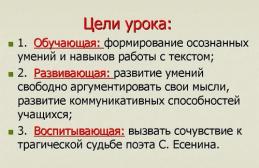
In 2018, Vladimir Semenovich Vysotsky would have celebrated his 80th birthday. In today's tutorial we will draw using basic Inkscape tools postage stamp.
We draw a stamp in Inkscape dedicated to V.S. Vysotsky
To work, we will need a photograph of Vysotsky. I used a photo previously prepared in Photoshop. It has been cropped, desaturated and the background has been removed. Let's get started.
Step 1.
Launch Inkscape and change the background. The background of the stamp itself will be white, so it is worth changing the background of the document. Let's go to settings Shift+Ctrl+D and change the color to any convenient for work
Then the tool Draw rectangles and squares draw a rectangle with .

To create perforation, draw a circle and duplicate it thirty times. Don't worry about them being uneven for now.
For alignment we use the panel . Select all the circles and first click center vertically, and then place the centers of objects vertically

As a result, we have evenly spaced circles. The color of the circles should be changed to another - they will be better visible.
Let's combine them - . We point them at the edge of the stamp, select our rectangle and circles and apply Contour-difference
We get perforation of the brand. We do the same with the remaining parties. After this we get a white stamp with perforation.

Step 2.
To create the background we use . Place four points to form a trapezoid and fill it with red. We cancel the stroke.

Apply to the figure Filter - Distortion - Pixel Smear. This will not create ragged, uneven edges.
At the end of this stage, import a photo of Vysotsky- File-import. Reduce and place on the stamp

Step 3.
The next step is very simple. You need to print the text and place it on the stamp. Under the portrait I placed the last name and first name, as well as the years of life. Vertical left inscription Post office and slightly lower the cost of the brand (any number). I was too lazy to draw the seal and instead of the sign of the stamp being canceled by the seal, I drew wavy lines using Bezier curves . It seems that stamps were also canceled using wavy lines. The result is the following brand.
Step 2
Create a new layer (

Step 3
In this step we will work on the edges of the stamp. Select the Oval Marquee Tool (

Step 4
Hold Shift, click on the right arrow (you'll move the selection 10 pixels) and hit Delete. Continue this process until you have completed the perimeter cut:

Step 5
Apply the Drop Shadow style (
Mode – Multiplication

Step 6
Create a new layer (

Step 7
Fill the selection with black.

Step 8
Find any image and paste it into our document over the black area. To ensure that the image is located within the black rectangle, you need to create a clipping mask. Hold Alt and click between the image layer and the rectangle.

Step 9
Using the Free Transform Tool (
Publications in the Museums section
Small Form Graphics, or Postal Miniature
The most replicated works of art that fly around the world along with the envelope. The postage stamp was invented by the British in 1840. A new artistic design for payment for correspondence arrived at Russian post offices in 1857 and became a new type of creativity for Russian painters. More about miniaturist artists and their creations - Natalya Letnikova.
Philatelists or art historians?
"Inverted Jenny" 1918 U.S. airmail stamp featuring a reversed image of a Curtiss JN-4 aircraft

"Tiflis Unique" ("Tiflis Brand"). A very rare postage stamp issued in Russian Empire(in the territory of modern Georgia) for the post office of Tiflis (Tbilisi) and Kojori in 1857

"Fast Jenny" A 1918 United States airmail stamp featuring a Curtiss JN-4 aircraft offset to the left side with an overlay on the stamp frame
Artists who create images for stamps balance between the laws of art and the criteria of philately. Initially, the assessment of a postage stamp is a matter for the post office itself. Philatelists value rare stamps, issued in small editions and non-standard ones: with typos and errors, like the “Inverted Jenny”. An image of an airplane printed upside down is worth about three million dollars.
“Tiflis Unique”, issued in 1857 for the Tiflis city post office, is considered by experts to be one of the most expensive domestic stamps. Initially it cost 6 kopecks - at an auction in 2008, one of the three surviving copies was valued at 700 thousand dollars.
For the benefit of society

One of the first postage stamps in Russia “In favor of orphans of active army soldiers.” 1904

Postage stamp from the series dedicated to the 300th anniversary of the House of Romanov. Peter I (from a portrait by Godfrey Kneller, 1698). 1913

Postage stamp from the series dedicated to the 300th anniversary of the House of Romanov. Alexander II (based on an engraving by academician Lavrentiy Seryakov from a portrait of Georg Botman, 1873). 1913

Postage stamp from the series dedicated to the 300th anniversary of the House of Romanov. Nicholas II (from an engraving by Fyodor Lundin, artist Richard Zarins). 1913
Bring ideas to the masses, be a mouthpiece for bright and significant events. Almost immediately after their appearance, brands “stepped up” to serve public interests. In 1904, during the Russo-Japanese War, by order of the Imperial Women's Patriotic Society, a series of stamps was issued with an allowance of 3 kopecks for the needs of orphans in the active army. Stamps were also used to raise funds during the First World War - for the wounded and families of the dead. These stamps depicted recognizable views and monuments of Moscow and St. Petersburg.
The special issue celebrated the 300th anniversary of the Romanov dynasty. The first and only series of commemorative stamps of the Russian Empire was issued in 1913. More often than others in this series there is a portrait of the then-ruling Nicholas II - on stamps in denominations of 7, 10 kopecks and 5 rubles. Sketches for the stamps from famous royal portraits were made by artists Ivan Bilibin, Evgeniy Lanceray and Richard Zarins.
New power - new brands

"Hand with a sword cutting a chain." First postage stamp Soviet Russia, made according to the sketch of Richard Zarins. 1918

"Aspidka" ("Slate-blue airship"). Rare USSR postage stamp from the “Airship Building” series. 1931

USSR stamp from the series “Fifth Anniversary” October Revolution" Artist Ivan Dubasov. 1922
Four years later, it was the artist Zarins who became the first author of stamps in Soviet Russia. A hand with a sword cutting a chain. Such a picture began to be printed almost immediately after the February Revolution. Since then, every event brings a new illustration in philately.
In the Soviet Union, images on stamps became a kind of chronicle of political life in the country. For example, a stamp for the fifth anniversary of the October Revolution is a work famous artist Ivan Dubasov. A worker carves the dates of the first revolutionary five-year plan on a stone slab. Special significance has a color scheme, accents, and font - even more catchy and readable than on the poster, because the brand is several times smaller.
Industrialization and airships, portraits of leaders and milestones in the development of statehood - like the adoption of the country's Constitution. Artists often worked on common theme whole creative teams. The philatelic series gained particular popularity: “Airship Engineering”, “Philately for Children”, “Nations of the USSR”... During the war years, stamps were dedicated to military units and war heroes, during peacetime the topics were very different: from Nordic combined to the flavored series “Gifts of Nature” .
The art of graphic miniatures

Postage stamp from the series “History of the Russian Fleet”. "Battleship Potemkin." 1972

Postage stamp “10 years of MOPR”, created according to a sketch by Fyodor Fedorovsky. 1932

Postage stamp for the birthday of composer Dmitry Shostakovich. 1976
“History of the Russian Fleet” is one of the most famous series in postal miniatures. The author Vasily Zavyalov made his first drawing for the brand at the age of 19, in 1925. In total, the artist became the author of more than 600 postage signs. The famous graph calculated: for creative success what is needed is “a steady hand, a keen eye and fidelity to nature.” These qualities are especially relevant when working on such a small picture.
Fyodor Fedorovsky also created postage stamps. One of the miniature works of the main artist of the Bolshoi Theater and the author of the project for ruby stars on the Kremlin towers is the design of the postage stamp “10 years of MOPR” (International Organization for Assistance to Fighters of the Revolution).
Creating a brand is like a kind of test of professionalism. Graphic artist Vladislav Koval, while studying at the Moscow Printing Institute, decided to write home to Dhaudzhikau and send a letter... with a self-portrait stamp drawn by himself. The mail missed the envelope, and two years later the enterprising artist was drawing a commemorative birthday stamp
Drawing a stampToday we will try to make a postage stamp with a curved corner.
Let's make a stamp first.
1.Create a document.

My document pixel resolution is set to 300, because I will use the resulting result for printing. For web publications, a resolution of 72 is sufficient.
2. Open the clipart - the stamp mask (you will find it at the end of the lesson), select the main view and transfer it to our document, adjusting the size.
Name the layer “shadow” 
3. Load a selection of the layer and fill it with white on a new layer, which is positioned immediately above the layer with the mask. Let's call the layer "mark".

4.Add a little noise.


5. Now let's fill it with some color. Press "Ctrl+U", the Hue|Saturation window will open, check the Colorize box and select the color that you like best. I chose these options.


6. Let's start with the image on the stamp.
To do this, choose whatever you like - a photo, a drawing, or create your own drawing.
I took a photo from the beginning of the 20th century. We transfer the image to our document, adjusting the size using free transformation. Let's call the layer “photo”. 
7. Let's age the photo a little. Let's add noise and change the color and saturation. Let's reduce the transparency to 90%. 
To make the design fit into the stamp, we will smooth out the edges.
To do this, activate the selection tool, set the Feather parameter to 5 and select an area slightly smaller than the drawing. Invert the selection and remove the excess. 
8. Using the same selection tool, draw a frame parallel to the stamp itself.
Above the layer with the stamp, create a new layer and make a rectangular selection (before this, do not forget to set the “Feather” parameter to 0). Let's make an edge with parameters of 2 pixels in the center, color black. 
Remove the selection and use a Gaussian blur.

Let's merge the layers with the brand.
9. Let's make a postmark.
On a new layer, use the Pencil tool and hold down the Shift key to draw a vertical line. (we need shift for a straight line, i.e. pressing it will not move the pencil to the side) 
Let's apply distortion.

Next, let's expand our curve horizontally. 

We need three such horizontal curves, press “Ctrl+J” twice. Distribute the two copies of the curve we just created one above the other and merge them into one layer (Ctrl+E) Let's call it “stamp”


Let's create a “worn” effect.
Reset the colors with the D key. Create a new layer (make sure it's the top one), load a selection on the “stamp” layer and add clouds (Filter->Render->Clouds).

Then add noise (Filter->Noise->Add Noise).

Set the blending mode to Hard Light

Let's merge the layers with the stamp and reduce the transparency of the resulting layer by 80%

10.Create a seal.
On a new layer, make a circle selection and an edge. The size of the edge depends on the size of the circle. In my case - 10 pixels. I deliberately made the circle large to make it easier to work with. Then, the finished print can be reduced in size. Let's call the layer “print”. 
Duplicate the layer and use Free Transform to reduce it to 80%.

Merge these two layers.
Now let's start with the inscription. So, as I have a photo of an English beauty on my stamp, I will make two inscriptions. Around the circle I will write the motto of the English kingdom - Dieu et mon droit (God and my right)” and in the middle the name of the country - United Kingdom of Great Britain and Northern Ireland (United Kingdom of Great Britain and Northern Ireland).
The motto is written.

Select the text layer, and then "Warp Text" from the text options. Select Arc / Horizontal / and set the bend value to 100%.

Using free transformation, we customize the text for printing.

Duplicate the layer and rotate the new layer 180 degrees (Edit->Transform->Rotate 180). Let's move the second layer to get the look like in the picture. 
In the middle of the seal I write the name of the country.

Merge the layers related to printing. We create a “worn” effect, as for a stamp. 
11. Let’s put the seal and stamp in place. If necessary, transform the sizes. 
12. Let's merge the layers with the seal and stamp. Load the selection of the “mark” layer, invert it and delete the excess on the resulting layer. Let's merge the layers.

13. Let's start creating a bent corner.
A) Let’s create an auxiliary document with the parameters of the “brand” layer.
To do this, load the selection and copy it 
We open a new document on which the dimensions have already been transferred from the clipboard 
and paste a copy.

B) Let's leave the document with the stamp alone for a while and move on to a new, created document with a transparent background.
Load the layer selection, select a radial gradient (from black to white), set the offset point to 80% and fill the layer from the left top corner diagonally downwards far beyond the boundaries of the document 
Now let’s change the contrast of this layer by going to Image – Adjustments – Levels

Now, one after another, apply Filter > Blur > Gaussian blur with parameters 8, 4, 2 and 1, alternately. This will remove the clear boundaries of the transitions and make it possible to more smoothly round the bend. Now let's save this document as psd. And immediately load its selection (Ctrl+click on the layer) and copy it to the clipboard Edit > Copy to transfer it to our original document with the stamp.
B) Now, we forget about this auxiliary document and switch to the document with the photo. And paste the copied file from the clipboard Edit > Paste. And we see that we have a new layer with a gradient. 
Temporarily make it invisible, we will need it in the end.
D) Activate the layer with the mark and go Filter > Distort > Displace. We set the parameters as I did and click OK, after which a window on your computer will open, in which you need to find the saved psd file and click on it.

Here is the first result. We see that the lower right corner of the stamp has changed, as if it was bent.

D) Now let’s activate the layer with the shadow and repeat the previous steps, with the only difference being that we’ll set the distortion parameters to -15%

Move the shadow a little down and to the right

Apply the filter Filter > Blur > Gaussian blur with the parameter 10px. Reduce transparency to 70%

E) Now, make the gradient layer visible. Load the selection of the layer with the mark (Ctrl+click on the layer), invert it Select > Inverse and with the gradient layer active, press Del. Change the blending mode of the gradient layer to Overlay

I forgot to write the cost of the stamp. But this detail can still be added.
And although I completely broke all the rules of “Penny Black”, I hope that the UK will not condemn me for a long time.
The objective of the lesson was not to ensure the authenticity of the image of the “Penny Black” series stamp.
Today we pursued other goals.
That's all. The stamp is ready.
I can add that the “curvature” of the image depends on the application of the gradient and increasing the parameters in the Displace filter.